If a hosting control panel is truly easy to use, you should feel that within the first ten minutes. Not after a training call. Not after hunting through five menus. Just a clean path from login to the task you came to do.
When people search for a hosting provider, they usually ask the same practical questions: Can I find my files quickly? Is email setup clear? Will DNS changes make sense? And if something breaks, can I restore a backup without panic? Official documentation from cPanel, Plesk, WordPress.org, and Cloudflare all point in the same direction: a good panel brings web, mail, DNS, files, databases, and recovery tools into one place.
This guide helps you judge that experience for yourself. I’ll show you what to test, what to ignore, and which signs tell you a control panel was designed for real customers instead of only for server administrators. If you are comparing providers, start with our website hosting and control panel pages, then use the checklist below before you commit.
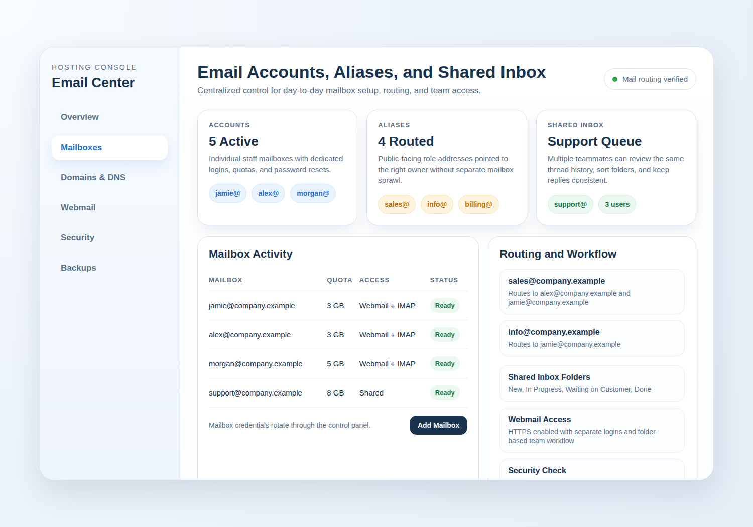
Why control panel usability matters more than feature lists
A long list of features can look impressive and still be frustrating in daily use. The real question is simpler: can you complete the jobs that keep a site and inbox running without feeling lost?
In practice, usability affects time, confidence, and error rates. If your team has to pause and guess where email settings live or which menu opens DNS, those delays become part of your operating cost. A panel that is easy to use makes routine work feel ordinary, and that is a good thing.
- Good usability saves time on every routine change.
- Good navigation reduces mistakes during DNS, SSL, and backup work.
- Good layout lowers training needs for non-technical staff.
Request email hosting if your team needs inboxes, aliases, and webmail in the same control panel.
The 5 tasks that reveal real usability: login, site setup, email, DNS, backups
The fastest way to judge a hosting panel is to test the five tasks most people actually perform. If these feel smooth, the rest of the interface usually follows the same pattern.
| Task | What easy looks like | What should make you pause |
|---|---|---|
| Login | One obvious sign-in path, clear account recovery, and no confusing handoffs | Multiple portals with unclear labels or hidden password reset steps |
| Site setup | A guided flow for domain, site, and SSL setup | Instructions spread across several support pages |
| Mailbox creation, aliases, and webmail access in one place | Email settings buried under unrelated server tools | |
| DNS | Readable record editor with plain labels and helpful defaults | Record types hidden behind jargon without explanations |
| Backups | Backup status and restore actions are visible and understandable | Restore options require support tickets for basic tasks |
For DNS specifically, Cloudflare’s record management guidance is a useful benchmark: records should be easy to create, edit, and review without guessing what each field means. That same standard should apply inside any hosting panel you evaluate.
Manage domains and DNS if your work depends on records, nameservers, and quick routing changes.
What a good dashboard should make obvious at a glance
A dashboard should answer a few questions immediately: Where am I? What needs attention? What do I do next? If the answers are visible without a tour, the panel is doing its job.
Look for a home screen that surfaces the essentials: websites, mail, domain settings, backup status, SSL status, and alerts. A tidy dashboard does not hide important items behind clever design. It gives them room to breathe.
- Clear labels for hosting, email, DNS, files, and backups
- Status indicators that explain whether something is healthy, pending, or needs action
- Search or shortcuts for common tasks
- Support links that are easy to spot when you need help
If you want a provider built around this kind of access, explore our control panel overview and then contact support with the questions you want answered before purchase.
How to test file, database, and domain management in minutes
You do not need a full migration to test the panel. A short, careful trial is enough to show whether the workflow is practical.
1) File management
Open the file manager and look for a layout that feels familiar: folders on one side, file actions on the other, and a clear path to upload or edit content. If the panel supports SFTP or FTP, confirm those options are documented plainly.
2) Database management
Database tools should not make you feel as though you wandered into a server room without a map. You should be able to create a database, assign a user, and find import or export options without hunting through unrelated settings.
3) Domain management
Check whether the interface makes it simple to find nameservers, DNS records, and domain status. If you need to move a site later, the panel should make the process understandable enough that you can plan it instead of fearing it.
WordPress.org’s server configuration guidance is a helpful reminder that file, database, email, and backup tasks are not side quests; they are core admin work. A good control panel respects that.
Review hosting options if you want a plan that keeps files, databases, and domains in one place.
Webmail and email hosting: what to check before you buy
Email is often where a control panel proves whether it is genuinely user-friendly. If your team can create a mailbox, open webmail, and manage aliases without support, that is a strong sign.
Before you buy, check for webmail access that is obvious from the dashboard, not hidden in a sub-menu. Make sure the panel shows mailbox storage, password controls, forwarding, aliases, and any spam filtering options in one consistent area. When webmail is easy to find, onboarding new staff becomes much calmer.
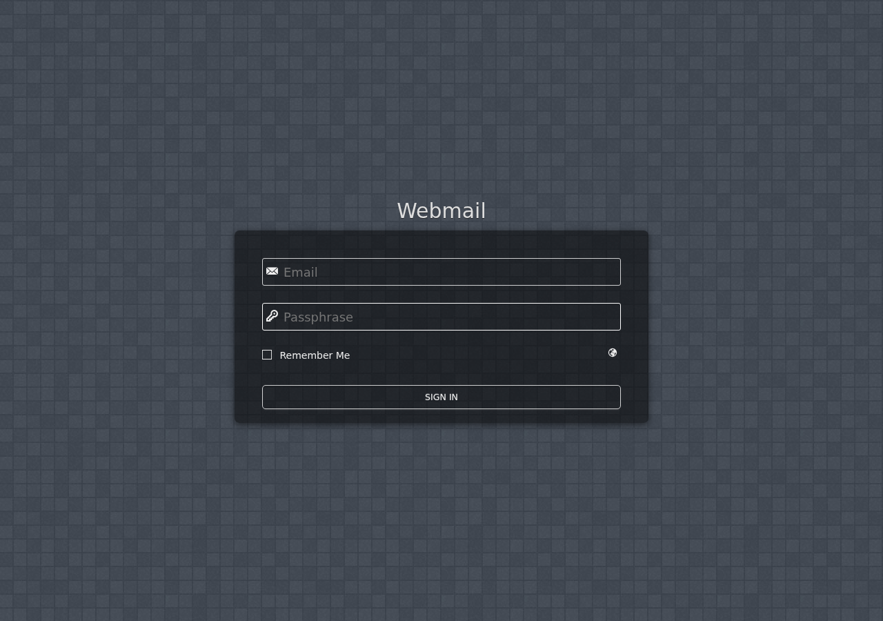
If you want to see how that should look in practice, visit our webmail and email hosting pages. You can also compare them against the support notes from your current provider before you move anything.
Security and backup controls that should be easy to find
Security should not feel like a hidden department. SSL, backups, access controls, and restoration tools should be visible enough that you know where to go before an urgent moment arrives.
Look for easy access to SSL status, renewal timing, and HTTPS enforcement. Backups should be equally straightforward: you want to know when they run, how long they are kept, and how to restore them. Cloudflare’s DNS documentation and the recovery guidance in hosting platforms both point to the same principle: clear recovery paths matter before you need them.
- SSL status is visible without opening advanced tools.
- Backups show date, retention, and restore options in plain language.
- Security alerts explain what happened and what to do next.
See security and backup features if you want to compare this area directly.
Signs the interface is built for customers, not just server admins
There is a difference between a powerful panel and a friendly one. A customer-focused interface does not assume you already know the vocabulary of servers. It explains itself as you go.
Some of the best signs are small: tooltips that answer real questions, labels that use plain language, and support links that appear near the task you are trying to finish. The interface should feel like a guide, not a maze.
- Plain labels instead of technical shorthand
- Step-by-step setup flows for common tasks
- Helpful hints near DNS, mail, and SSL settings
- Easy access to contact support when a task fails
If the panel keeps forcing you into documentation for basic work, that is a sign to pause. The best systems still offer documentation, of course, but they do not require it for everyday tasks.
Contact support if you would like help comparing features before you switch.
A simple pre-purchase checklist for comparing providers
Use this checklist during demos, trials, or sales calls. It is meant to keep the decision practical.
| Check | Pass if… | Why it matters |
|---|---|---|
| Login and recovery | You can sign in and reset access without confusion | Early friction often becomes daily frustration |
| Site setup | There is a guided path for launching a site | Good onboarding reduces mistakes |
| Email and webmail | Mailboxes, aliases, and webmail are easy to reach | Email is part of the core service, not an afterthought |
| DNS | Records and nameservers are labeled clearly | DNS mistakes can interrupt website and email delivery |
| Files and databases | Basic content and database tasks are obvious | These are routine tasks for owners and agencies |
| Backups and restore | Restore options are visible and understandable | Recovery should not require guesswork |
| Support access | You can contact help from inside the account | Good support shortens the time to resolution |
When you finish the checklist, compare the panel against your real work, not against marketing phrases. If a provider gives you a clean path for website hosting, email, and domain management, you will feel it right away.
Return to the homepage for a quick overview of the services available on this site, or request hosting plan if you are ready to talk through your needs.
Quick takeaways
- Easy control panels make common tasks feel obvious, not ceremonial.
- Login, setup, email, DNS, and backup workflows reveal most usability problems quickly.
- A good dashboard surfaces status, alerts, and next steps at a glance.
- File, database, and domain tools should be reachable within minutes.
- Security and backups should be clear enough to use before anything goes wrong.
If you want a straightforward place to start, compare website hosting, email hosting, and control panel details side by side, then choose the provider that makes everyday work simpler.